- Topics›
- Immigration/migration in the United States›
Moving
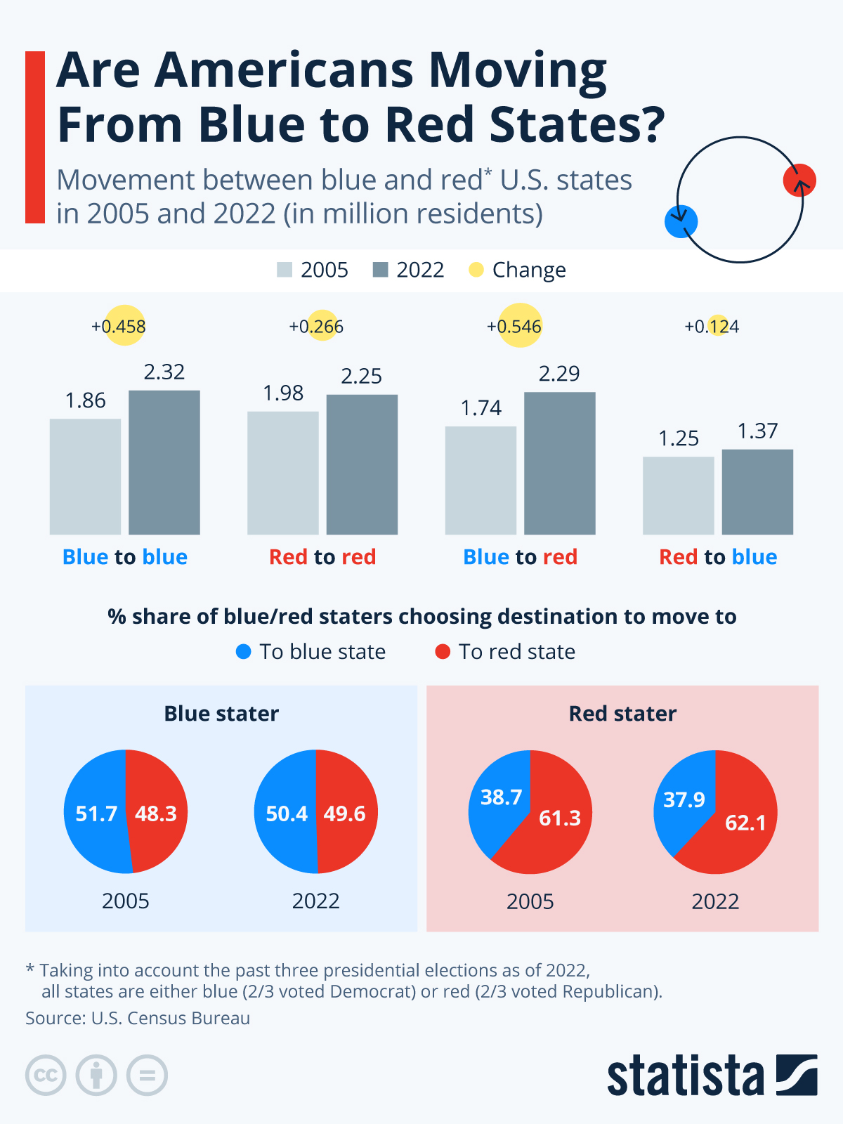
In the last couple of years, large U.S. states where a majority of voters support Democrats – so-called blue states – have been losing population, while some large red states, where there is majority support for Republicans, have gained residents. An analysis of Census Bureau data shows that there are in fact some big movements of people from states currently defined as blue to those currently defined as red. However, the situation is more accurately described as more people exiting certain blue states – for example New York and California – and heading to other states in general, may they be red or blue.
In 2005 and 2022 alike, those moving from blue states have been almost equally splitting up between blue and red states. Only their total number has been increasing, from 3.7 million or 2.4 percent of blue states’ population to 4.6 million or 2.7 percent of population in the given years, boosting migration to both red and other blue states.
At the same time, migration from red states has not changed as much – increasing only from 3.3 million in 2005 to 3.6 million in 2022. As in blue states, the split of destinations has stayed almost exactly constant over the years, with red staters choosing other red states 61-62 percent of the time and blue states only 38-39 percent of times. This means that compared with the mid-2000s, blue states now transfer more than 500,000 more residents towards red states annually (and about as many within blue states). Inflows from red states to blue states have only increased by a little more than 100,000 per year in this time frame. So while it might be true that a high cost of living and a (perceived) low quality of life is driving people away from certain blue states, this is not driving them towards red states more than in the past, relatively speaking.
Migration from abroad is also boosting U.S. populations. In 2022, around 1 million more people immigrated into the United States than left the country. International migrants had traditionally chosen larger cities in both red and blue states, but this type of migration has diversified over the past decades. While this leaves both states like Texas and New York with fewer (official) international arrivals, it has had a more detrimental effect in blue states that already suffer from domestic out-migration.
For the sake of this analysis, states are assigned the designation blue or red based on their vote in the last three presidential elections. For comparability, the definition of red states and blue states was not changed for 2005. Colorado, Virginia and Nevada – where domestic immigration has boomed recently – would technically be defined as red states, not blue, in 2005. However, patterns of migrations for these states are consistent between 2005 and 2022 instead of changing upon their reorientation, also supporting the hypothesis that U.S. migration flows are relatively constant and dependent on factors like location and proximity rather than politics.

Katharina Buchholz
Data Journalist
katharina.buchholz@statista.com


Description
This chart shows the movement between blue and red* U.S. states in 2005 and 2022 (in million residents).
Report
Infographic Newsletter
Statista offers daily infographics about trending topics, covering:Economy & Finance, Politics & Society, Tech & Media, Health & Environment, Consumer, Sports and many more.
Related Infographics
FAQ
The Statista "Chart of the Day", made available under the Creative Commons License CC BY-ND 3.0, may be used and displayed without charge by all commercial and non-commercial websites. Use is, however, only permitted with proper attribution to Statista. When publishing one of these graphics, please include a backlink to the respective infographic URL. More Information
The Statista "Chart of the Day" currently focuses on two sectors: "Media and Technology", updated daily and featuring the latest statistics from the media, internet, telecommunications and consumer electronics industries; and "Economy and Society", which current data from the United States and around the world relating to economic and political issues as well as sports and entertainment.
For individual content and infographics in your Corporate Design, please visit our agency website www.statista.design
Any more questions?
Get in touch with us quickly and easily.
We are happy tohelp!
Do you still have questions?
Feel free to contact us anytime using our contact form or visit our FAQ page.
Your contact to the Infographics Newsroom

Felix Richter
Data Journalist
felix.richter@statista.com +49 (40) 284 841 557

Statista Content & Design
Need infographics, animated videos, presentations, data research or social media charts?
The Statista Infographic Newsletter
Receive a new up-to-date issue every day for free

- Our infographics team prepares current information in a clear and understandable format
- Relevant facts covering media, economy, e-commerce, and FMCG topics
- Use our newsletter overview to manage the topics that you have subscribed to
